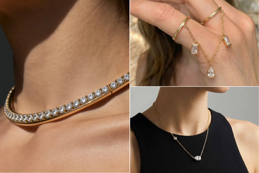
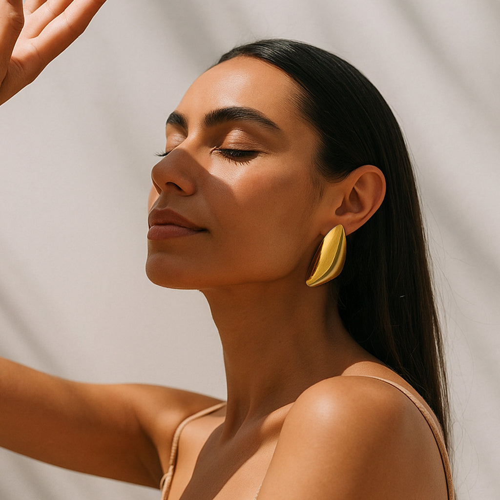
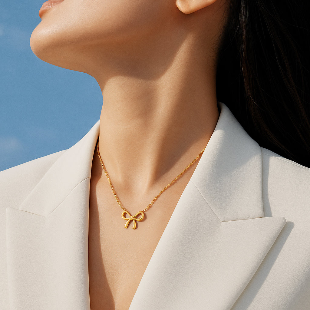
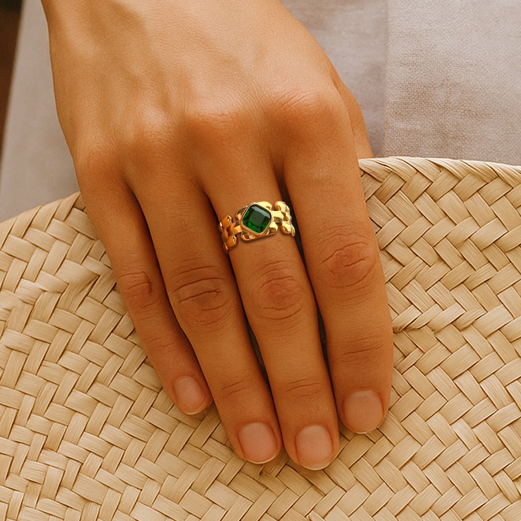

Why Jewellery Photographs Differently Than It Looks in Person (And How to Buy Online Without Regret)?
You have probably felt this before. A pair of hoop stud earrings looked substantial and brilliant on your screen, but when the parcel arrived, they were lighter, smaller, and a shade less golden than you remembered from the photo. Or a layered necklace that sat in perfect, airy layers on the model looked bunched together the moment you put it on. A stackable ring that looked delicate and fine in a close-up photo felt slightly chunkier on your finger than expected.
None of this necessarily means anyone tried to mislead you. Jewellery is one of the hardest product categories to photograph accurately. Metal reflects light unpredictably. Gemstones bend and scatter it. Cameras record light differently than your eyes do, and screens display colour differently depending on their settings. A pendant that is two centimetres tall can look twice that size in a macro shot designed to show off its detail.
This guide is not about distrust. It is about literacy, learning to read a jewellery photograph the way an experienced buyer does, so that what arrives at your door rarely surprises you. By the end, you will know how lighting and camera settings affect what you see, how to judge real-world size and fit from a listing, how gold plated jewellery and silver plated jewellery behave differently under studio lights, and what questions actually matter before you click "buy."
You cannot always make a buying decision based on a single photograph. But you can learn exactly what to look for so the photograph works for you instead of against you.
Why Jewellery Can Look Different Online?
Before getting into the mechanics, it helps to understand the basic truth: a jewellery product photo is not a neutral, unfiltered record of the object. It is a photograph, taken under artificial light, through a lens, processed by a sensor, and then displayed on your particular phone or laptop screen, each of which renders colour and brightness slightly differently.
None of these steps are inherently dishonest. They are simply how photography works. The problem is that jewellery, more than almost any other product category, is extremely sensitive to light. A t-shirt looks roughly the same colour whether it is lit from the front or the side. A polished metal chain does not. Change the angle of a single studio light by a few degrees, and a gold plated bracelet can shift from a soft honey tone to a near-white highlight in one section.
Once you understand this, the goal shifts. Instead of asking "does this photo look exactly like what I'll receive?", which is often an unfair question to ask of any photograph, you start asking better questions: What does this photo actually tell me? What is it not telling me? What else should I check before I decide?
That shift is what this entire guide is built around.
The Core Problem: What Jewellery Photos Can and Cannot Tell You
Why Do Product Photos Make Jewellery Look More Gold or Shiny Than It Really Is?

Metal is reflective by nature, and a polished gold plated or silver plated surface behaves almost like a small mirror. When light from a studio softbox hits a polished chain or earring, that light bounces straight back toward the camera as a bright highlight, a "specular reflection." Your eye, when you hold the same piece in your hand, sees those highlights too, but it also adapts constantly as you move the piece, so the brightness feels less extreme than a single frozen frame from a camera.
Several factors compound this:
-
Directional studio lighting creates strong highlights on curved and polished surfaces, which can make gold jewellery look richer and silver jewellery look almost blinding-white in a still photo.
-
White balance, the camera's way of correcting colour temperature, can subtly warm up or cool down the entire image, shifting how "gold" the gold actually appears.
-
Exposure and contrast settings brighten highlights and deepen shadows, which increases the sense of shine and depth.
-
Reflective or glossy backgrounds can bounce colour back onto the jewellery, subtly tinting the metal.
-
Surrounding colours in the frame, a coloured backdrop, styling props, or the model's skin tone, influence how the human eye perceives the metal's warmth or coolness, even though the metal itself hasn't changed.
It's worth being clear here: this doesn't mean every product photo has been heavily edited or that brands are trying to deceive you. Even a completely unedited, professionally lit photograph will often look different from the same piece viewed under your bathroom mirror or overhead kitchen light, simply because cameras and eyes process light differently. A camera sensor captures a single exposure at a single moment; your eye is constantly adjusting as you move an object around, so the "shine" you perceive is more like an average across many angles rather than the one flattering angle a camera happened to catch.
How Lighting and Camera Filters Change the Way Jewellery Looks Online?
To understand why the same necklace can look different across two listings, it helps to know a few basics of how jewellery photography actually works.
Studio lighting setups commonly use softboxes (large diffused light panels) to spread light evenly and reduce harsh shadows. Some brands use more directional lighting to create drama and highlight texture. Backlighting can be used to make a piece glow at the edges. None of these are "wrong" they're stylistic choices, but each changes how bright, warm, or dimensional the piece appears.
Macro photography, extreme close-up shots, is designed to show fine detail: the texture of a setting, the facets of a stone, the finish of a clasp. It is not designed to communicate real-world scale, and it often exaggerates size perception because the piece fills the entire frame.
Camera exposure and white balance control brightness and colour temperature respectively. A slightly overexposed shot will look brighter and shinier than the naked-eye reality. A warm white balance will push gold tones richer; a cool white balance will make silver tones look crisper and whiter.
Colour grading and filters, when used, adjust the overall mood of an image, sometimes to match a brand's aesthetic across a catalogue. This can subtly shift colour saturation.
HDR (High Dynamic Range) processing blends multiple exposures to preserve detail in both shadows and highlights, which can make a piece look unusually crisp and vivid compared to how it appears in ordinary room lighting.
The difference between a professional product photo and a casual phone photo matters too. A studio image is optimised to look appealing and to show detail clearly. A phone photo taken in your own home, under mixed lighting, with a moving hand, will almost always look flatter and less dramatic, even though it's the same piece of jewellery.
What to Compare Instead of Colour Alone
Rather than fixating on how bright or golden a single hero image looks, get into the habit of checking:
-
Multiple photographs from different angles, not just the main listing image
-
At least one close-up image and one standard, full-piece image
-
Images shot against a neutral or plain background, where colour distortion is less likely
-
Model or "worn" photographs, which show real-world scale against a human body
-
Videos, if the brand provides them, video under changing light is one of the most honest formats available
-
Customer-submitted photos, where available, since these are typically shot in ordinary conditions
-
The written product description and material information, which won't change no matter how the lighting looks
What Jewellery Product Photos Never Show You (and Why It Matters)
Even a generous set of well-lit photographs has limits. No photograph, however good, can fully communicate:
-
True scale — without a reference object or precise dimensions, it's genuinely difficult to judge size from an image alone
-
Weight — a chain can look delicate but feel substantial in the hand, or vice versa
-
Thickness — especially for rings, chains, and cuffs, where a few millimetres make a real visual difference
-
Flexibility and movement — how a bracelet drapes, how a necklace layers, how an anklet swings
-
Texture underfoot — a hammered or textured finish photographs differently than it feels
-
Clasp size and mechanism — often the most overlooked detail, and one that affects daily usability
-
Chain thickness relative to the pendant, which affects how "delicate" or "statement" the piece actually reads
-
Underside construction — how a setting is finished on the back, which is rarely photographed
-
Comfort and stiffness — whether a cuff bracelet or ring band feels rigid or has some give
-
How reflective the surface really is under normal home or office lighting, rather than studio lighting
-
How the jewellery moves on the body during everyday activity, rather than in a single still pose
A piece photographed beautifully against a clean white studio background is not the same experience as seeing it worn while someone is walking, talking, or reaching for something. That's not a flaw in the photography, it's simply a limitation of what any still image can convey.
Before Buying, Look for These Details
Use this as a quick checklist for any listing:
-
Product dimensions (length, diameter, width, thickness, in millimetres or centimetres, not just "small/medium/large")
-
Model height and, where provided, the model's jewellery size or the reference size used in photos
-
Chain length and whether it is adjustable
-
Pendant dimensions
-
Earring dimensions (diameter for hoops, length for drops)
-
Bracelet internal circumference
-
Ring size guidance
-
Anklet length and extender options
-
Clasp type and details
-
Material composition (base metal, plating type)
-
Plating information, where disclosed
-
Care instructions
-
Return and exchange policy
If a listing is missing several of these, it doesn't automatically mean something is wrong, but it does mean you have less information to work with, and it's worth looking a little harder or asking the brand directly before buying.
How to Judge Jewellery by Product Type?
How to Judge Hoop and Stud Earring Size from a Photo Before You Buy
Earrings are deceptively easy to misjudge because so much depends on scale references that photos often don't provide clearly. A hoop photographed in isolation, filling most of the frame, can look considerably larger than it is. The same hoop shown on a model's ear, next to their jawline and hair, often reads more accurately, but even then, ear size varies from person to person, so a hoop that looks proportionate on one model's ear may sit differently on yours.
Key things that affect perceived size in a photo:
-
Diameter — for hoops, this is the single most important number to check against the listed measurement
-
Width and thickness — a thin, fine hoop and a thick, chunky hoop of the same diameter will photograph very differently
-
Camera perspective — a front-facing close-up shot compresses depth and can make earrings look flatter and larger than an angled shot
-
Model's individual features — ear size, hairstyle, and head angle all change how "big" the same earring appears
Rather than relying on visual impression alone, use the listed diameter and compare it to something you already own. Pull out a pair of studs or hoops from your own jewellery box, measure them with a ruler, and hold that measurement up next to the number in the listing. This single habit resolves more sizing confusion than any amount of staring at photos.
It also helps to think in rough categories, understood as approximate examples rather than fixed industry standards: very small studs might sit around 4–6mm, everyday studs around 6–10mm, small hoops might start around 15–20mm in diameter, medium hoops around 25–35mm, and oversized statement hoops beyond that. These are illustrative only, always check the actual listed dimension rather than assuming a size from a category label.
How to Tell If Layered Necklaces Will Actually Sit the Way They Look Online

Layered necklace photos are often styled deliberately to show clean, separated layers, sometimes with tape, clips, or careful positioning behind the scenes so each chain is visible and none overlap. That's a legitimate styling choice to help you see each piece clearly, but it doesn't always reflect how the layers will fall during ordinary wear, when chains naturally move, twist, and rest against each other depending on your neckline and posture.
What actually determines how a layered necklace sits:
-
Individual chain lengths and the gap between them, a bigger length difference generally means cleaner separation
-
Pendant size and placement, which can pull a chain forward or cause it to sit closer to the body
-
Your neckline, a crew neck, V-neck, or off-shoulder top changes where each chain naturally falls
-
Neck and collarbone proportions, which vary from person to person
-
Chain thickness, since finer chains tend to tangle more easily than sturdier ones
-
Layering order, if the set is sold as separate pieces meant to be worn together
-
Adjustable extenders, which let you fine-tune each layer's drop
-
Everyday movement, the layers you see in a still photo may shift and re-settle constantly as you move
Before You Buy — Layered Necklace Checklist
-
Are the individual chain lengths listed, not just an overall description?
-
Is there a visible gap (ideally 2–5cm) between each stated length?
-
Does the listing mention extenders for adjustability?
-
Is the pendant size given, and does it match how prominent it looks in photos?
-
Have you checked a photo of the necklace against a plain neckline, not just a styled outfit?
How to Choose the Right Hand Bracelet Size Without Trying It On?

Bracelet fit comes down to comparing your wrist measurement against the bracelet's internal circumference or diameter, not the visual impression of "loose" or "snug" from a photo, which can be misleading depending on how the model wears it (some intentionally photograph bracelets with a looser drape for a relaxed look).
To measure your wrist at home:
-
Wrap a soft measuring tape (or a strip of paper/string, then measure against a ruler) around your wrist, just below the wrist bone, where you'd naturally wear a bracelet.
-
Note the circumference in centimetres or millimetres.
-
Compare this to the bracelet's internal circumference as listed by the brand, not to a generic "small/medium/large" label, since these vary between brands.
-
For a looser, more relaxed fit, look for a bracelet with 1–2cm more circumference than your wrist measurement; for a snugger fit, look for one closer to your exact measurement.
It's also worth distinguishing between bangle-style bracelets, which are rigid and have a fixed internal diameter, and chain-style hand bracelets for women, which are often adjustable via extender links or sliding clasps and therefore more forgiving. Because sizing conventions differ from brand to brand and even between collections from the same brand, always check that specific product's size guide rather than assuming your bracelet size will be consistent everywhere.
How to Buy Stackable Rings Online Without Guessing the Fit

A stackable ring photographed alone often looks finer and more delicate than it feels once worn, partly because macro photography emphasises detail over scale, and partly because a single ring on its own reads differently than the same ring stacked with two or three others, which is how most stackable rings are actually intended to be worn.
Things that affect fit and appearance:
-
Ring size, which should always be measured for the specific finger you intend to wear it on
-
Band width, a wider band will generally feel snugger at the same numerical size than a narrower one, because it contacts more of your finger
-
Stacking multiple bands together adds bulk, which can change comfort even if each individual ring fits well alone
-
Dominant vs non-dominant hand, many people find their dominant hand's fingers are very slightly larger
-
Knuckle size relative to the base of the finger, if your knuckle is noticeably larger than the base, you may need a size that fits over the knuckle comfortably while still sitting securely lower down
-
Temperature-related changes, fingers can swell slightly in heat and shrink in cold, which is why ring size can feel different across seasons
A Simple Home Measurement Method
-
Wrap a strip of paper or string snugly around the base of your finger.
-
Mark where it overlaps, then measure that length with a ruler.
-
Compare this circumference to a standard ring size chart, or to the brand's specific sizing guide, since numbering systems vary internationally.
-
If you plan to stack multiple rings on the same finger, consider sizing slightly looser to accommodate the added bulk of a stack.
How to Judge Anklet Length and Fit from Product Photos Alone

Anklets are often shown on a model's ankle at an angle chosen to make the design's charms or chain pattern most visible, which can distort how long or short the piece looks relative to your own ankle circumference.
Key measurements to check:
-
Ankle circumference, measured the same way as a wrist, with a soft tape just above the ankle bone, where the anklet will naturally sit
-
Total anklet length, as listed by the brand, not estimated from the photo
-
Adjustable or extender chains, which allow you to fine-tune the drop or looseness
-
Desired drop and movement, some people prefer anklets snug against the skin, others prefer a slight jingle and movement, especially for chain or charm styles
-
Charm placement, which can shift depending on how loosely the anklet sits
-
Footwear interaction, an anklet meant to be worn with sandals may sit and photograph differently than one intended for barefoot or everyday wear
To measure your own ankle, follow the same tape-and-ruler process used for wrists, then compare against the brand's stated length and any adjustable range, rather than judging purely from how long the chain looks in a styled photo.
What to Check Before Buying a Mangalsutra Online?

A mangalsutra for women involves a few extra considerations beyond a standard pendant necklace, since both the chain and the pendant carry visual and personal significance, and proportions can read very differently depending on the wearer's frame and how the piece is styled in photos.
Worth checking before buying:
-
Chain length, and whether it's fixed or adjustable
-
Pendant dimensions, height and width, not just a general size description
-
Pendant visual presence, how prominent the design looks relative to the chain, which can be affected by close-up photography
-
Bead size and count, for designs incorporating black beads, since bead size affects how substantial the piece appears
-
Chain construction, whether it's a fine link chain, a beaded chain, or a broader design
-
Adjustable length options, useful if you want flexibility between everyday and occasion wear
-
Clasp type, especially if the piece will be worn daily and needs to be easy to fasten and unfasten
-
Model proportions and neckline in the product photos, since a mangalsutra that looks delicate on one frame may look more prominent on a smaller frame, or the reverse
A mangalsutra photographed as a close-up hero shot can look more substantial or more delicate than it will look during actual daily wear, depending on your own neckline and how the pendant catches light against your skin tone. As with other categories, comparing multiple photo angles and checking exact measurements is the most reliable way to judge how it will actually look on you.
Materials and Photography: Managing Expectations
Why Gold Plated Jewellery Looks Brighter in Photos Than in Real Life

Gold plated jewellery has a naturally reflective, polished surface, and under warm studio lighting, that surface can pick up strong highlights that make the piece look especially rich and luminous. This is a genuine optical effect, not necessarily a sign of retouching, polished metal simply reflects concentrated studio light more intensely than the softer, more diffused light of an average room.
It's important to be clear: a photograph looking brighter does not mean the piece contains more actual gold, nor does it say anything by itself about plating thickness or durability. Brightness in a photo is a lighting outcome, not a purity measurement.
What to check instead of relying on visual brightness:
-
Base metal — commonly brass, stainless steel, or sterling silver as the foundation beneath the gold layer
-
Plating material — typically described as gold plating, gold vermeil, or similar terms, each with different meanings
-
Plating thickness, if the brand discloses it (often measured in microns)
-
Finish — polished, brushed, matte, or textured, which affects both appearance and how the piece wears over time
-
Care instructions, since plated jewellery generally requires more careful handling than solid gold — avoiding water, perfume, and friction where advised
-
Warranty or plating-life information, where a brand offers it
These details tell you far more about what you're actually buying than how shiny the hero image looks.
Why Silver Plated Jewellery Can Look Whiter or Duller Online Than It Really Is
Silver plated jewellery interacts with light differently than gold-toned pieces, and it's especially sensitive to white balance and background colour. Shot against a pure white background under cool or neutral lighting, silver-toned jewellery can look almost stark white — sometimes appearing brighter and more mirror-like than it does in person. Shot under warmer lighting or against a coloured background, the same piece can look duller, greyer, or slightly muted.
Contributing factors include:
-
Neutral vs cool-toned lighting, which changes how "white" or "warm" the silver appears
-
White or light-coloured backgrounds, which can make silver-toned metal look even brighter by contrast
-
Camera white balance, which can shift the overall colour cast of the image
-
Surface finish — a high-polish silver finish reflects more sharply than a brushed or matte one
-
Surrounding colours in the frame, which subtly influence perceived tone
Because silver-toned jewellery can look meaningfully different from one photo to the next depending on these factors, it's worth comparing several images — ideally including one against a neutral background and one worn — rather than judging tone from a single hero shot.
Demi-Fine Jewellery Online: How to Tell Real Quality from Good Photography

This is one of the most important distinctions to understand as an online jewellery shopper: attractive photography is not proof of product quality. A well-lit photo, a polished styling shoot, and a clean white background can make almost any piece look expensive. What actually determines quality is materials and construction — details that a photo often doesn't fully reveal.
Materials to look at:
-
Base metal (brass, stainless steel, sterling silver)
-
Precious-metal content, where applicable (for example, solid gold components in a demi-fine piece)
-
Plating type and thickness, where disclosed
-
Gemstones — natural, lab-grown, or simulated, and how this is described
-
Gemstone specifications, such as cut and approximate carat weight, where relevant
Construction to look at:
-
Clasp quality and mechanism
-
Link and chain construction — smooth movement, no obvious weak points
-
Prong and setting security for stones
-
Visible soldering or connection points, where photos allow
-
Symmetry between matching pieces, like a pair of earrings
-
Overall finishing — smooth edges, no visible rough spots
Brand transparency to look at:
-
Clear material disclosures in the product description
-
Specific dimensions rather than vague descriptions
-
Care instructions appropriate to the material
-
Warranty information, where offered
-
A clear return and exchange policy
-
Certifications, where relevant (for example, for natural gemstones)
The distinction worth internalising is the difference between "this looks expensive" and "this is made with quality materials and construction." A skilled product photographer can make almost any well-designed piece look expensive. Only the material and construction details, most of which live in the written description, not the photo, tell you whether that impression holds up in daily wear. Brands that are transparent about these specifics, alongside their photography, are generally easier to buy from with confidence. For instance, browsing a demi fine jewellery collection is a useful way to see how dimensions, materials, and worn photography can be presented together.
How to Reduce Regret Before You Buy
Questions to Ask Before Buying Jewellery Online (That Most People Skip)
Most buyers check the price and the photos, then decide. A slightly more deliberate approach, asking a few extra questions before adding to cart, meaningfully reduces the odds of disappointment. Worth checking or asking about:
-
What are the exact dimensions (length, diameter, width, thickness)?
-
What is the base metal and plating material?
-
Is plating thickness disclosed?
-
What is the surface finish, polished, matte, brushed, textured?
-
What does the piece weigh, if that matters to you (for larger statement pieces especially)?
-
Is the chain length fixed or adjustable, and by how much?
-
What is the exact ring size range or sizing method?
-
What is the bracelet's internal circumference, and is it adjustable?
-
What is the anklet's length and adjustable range?
-
What type of clasp is used, and is it easy to fasten alone?
-
Are there additional photos or a video available, beyond the main listing image?
-
Is there a model photo, and if so, what is the model's height or reference size?
-
What are the care instructions?
-
What is the return and exchange policy, and does it cover sizing or appearance concerns?
-
Is there a warranty, and what does it cover?
You don't need to ask every question for every purchase, but for a piece you're genuinely unsure about, even three or four of these can resolve most of the uncertainty a photo alone leaves behind.
How to Read Jewellery Size Charts and Measurements Correctly
Jewellery measurements use a small, specific vocabulary, and misreading them is one of the most common causes of sizing disappointment.
-
Diameter — the distance across a circular shape (used for hoops, bangles measured internally)
-
Circumference — the distance around a shape (used for rings, bracelets, anklets)
-
Length — the total drop or extent of a piece (used for necklaces, chains, drop earrings)
-
Width — how wide a band or chain link is
-
Thickness — how thick the metal itself is, distinct from width
-
Chain length — usually measured end to end, sometimes listed with adjustable range
-
Pendant height and width — the pendant's own dimensions, separate from the chain
A crucial point: a 10mm diameter is not the same as a 10mm length, and neither tells you anything about width or thickness on its own. Two rings can both be "size 10mm width" and feel completely different if one is a flat band and the other is a domed band. Visual proportion in a photo is not a substitute for the actual stated number.
A Simple Measurement Rule
Before ordering, take an actual ruler and mark out the stated dimension, for example, draw a 25mm line for a hoop diameter, or measure a 45cm length of string for a necklace chain. Hold it up, loop it, or place it against your body. This ten-second habit does more to prevent sizing surprises than any amount of zooming into a photo.
Zoomed-In vs True-to-Life: How to Read Product Photos Like a Pro
Close-up, macro-style photography is one of the most useful, and most misleading, if misread, tools in jewellery photography. It's designed to reveal fine detail: stone facets, textured finishes, clasp mechanisms, engraving. Because the piece fills the entire frame, it can also make jewellery look larger, heavier, and more substantial than it actually is once you're holding it at a normal viewing distance.
To read product photos accurately, compare across multiple formats rather than relying on any single image:
The 5-Point Photo Test
-
Close-up product photo — good for detail, not for scale
-
Standard product photo, ideally against a neutral background, better for judging proportion
-
Model or worn photo — the most useful for real-world scale, provided you also check the model's height or reference size
-
Side or angled photo — reveals thickness, depth, and profile that front-facing shots hide
-
Listed dimensions — the only truly objective data point, unaffected by lighting or lens choice
If a video is available, it's often the single most honest format, since it shows the piece moving and catching light from multiple angles in real time, rather than one carefully chosen frame.
What to Do If Jewellery Looks Different From the Photos When It Arrives

Some degree of visual difference is normal and expected, differences in colour, shine, apparent size, or texture can genuinely arise from photography, lighting, screen calibration, and even the specific device you're viewing it on. This doesn't automatically mean anything went wrong.
That said, it's fair and reasonable to compare what arrives against what was actually promised — not against a vague visual impression, but against the concrete details the brand provided:
-
The written product description
-
The listed dimensions
-
The stated material and plating information
-
Any specifications given at the time of purchase
-
Your order confirmation
If, after this comparison, the item appears materially different from what was represented, for example, dimensions that don't match what was listed, or a material that doesn't match the description, here's a sensible way to handle it:
-
Photograph the item yourself in neutral, natural lighting (daylight near a window works well).
-
Compare your photo directly against the product listing images.
-
Re-check the measurements against what was stated at purchase.
-
Review the brand's return or exchange policy to understand your options and any time limits.
-
Contact the seller promptly, rather than waiting.
-
Clearly and specifically explain the discrepancy, what was expected versus what arrived, with measurements or details where possible.
-
Keep the original packaging and order documentation, as many return processes require this.
A reasonable, well-documented approach like this tends to get resolved far more smoothly than a vague complaint that "it doesn't look like the photo," because it gives the brand something concrete to work with.
The 60-Second Jewellery Photo Reality Check
Before you check out, run through this quick list:
-
Did I check the actual listed dimensions, not just the visual impression?
-
Did I look at the jewellery on a model or in a worn photo?
-
Did I look at more than one photograph, from different angles?
-
Did I check the base material and plating information?
-
Did I check the surface finish (polished, matte, textured)?
-
Did I check the length, size, or circumference against my own measurements?
-
Did I compare it with something similar I already own?
-
Did I look for a video, if one was available?
-
Did I check the return and exchange policy?
-
Am I judging quality mainly by how shiny or bright the photo looks, or by the actual material and construction details?
If you can tick most of these, you're buying with real information, not just an impression.
Reading Jewellery Photos: A Quick Reference Table
|
What You See in the Photo |
What It May Actually Mean |
What to Check |
|
Extremely bright, glowing gold |
Studio lighting creating specular highlights on a polished surface |
Base metal, plating type, finish description, additional photos in different lighting |
|
Very reflective, mirror-like silver |
Cool white balance and a light background amplifying brightness |
Material description, close-up and neutral-background photos |
|
Large-looking hoop or stud earrings |
Macro/close-up framing filling the entire image |
Listed diameter, model photo, comparison with your own earrings |
|
Perfectly separated necklace layers |
Deliberate styling to showcase each chain individually |
Individual chain lengths, gap between lengths, extender options |
|
Extremely detailed, textured ring |
Macro photography designed to reveal craftsmanship, not scale |
Band width, thickness, side-profile photo |
|
Loose-looking bracelet on a model's wrist |
Styling choice for a relaxed drape, or a genuinely adjustable design |
Internal circumference, adjustable range, your own wrist measurement |
|
Very delicate-looking pendant |
Thin chain or small scale in the photo, sometimes shot from a flattering angle |
Pendant height/width dimensions, chain thickness, worn photo |
7 Jewellery Photography Red Flags to Watch For

These signs don't automatically mean a seller is untrustworthy, but they are good reasons to look further, ask a question, or seek more information before you buy:
-
Only one product image available. A single angle makes it hard to judge proportion, finish, or true colour.
-
No dimensions listed anywhere. Without measurements, you're relying entirely on visual impression, which is the least reliable way to judge fit.
-
No material or plating information. This is essential for understanding both appearance and durability expectations.
-
No worn or model photograph. Scale is genuinely difficult to judge without a human reference point.
-
Extreme close-ups with no accompanying standard shot. Detail without context can distort perceived size.
-
Noticeably inconsistent appearance between photos. Some variation is normal, but if the colour or scale looks dramatically different across images with no explanation, it's worth asking why.
-
Unclear or missing return and exchange information. This matters most when a purchase doesn't turn out as expected, so it's worth confirming before, not after, you buy.
If you spot one or two of these, it's not necessarily a dealbreaker, just a prompt to dig a little deeper, perhaps by messaging the brand directly, before completing your purchase.
Frequently Asked Questions
1. Why does jewellery look different in photos than in person?
Mainly because of lighting, camera exposure, white balance, and the reflective nature of metal and gemstones. Cameras capture light differently than the human eye, and studio lighting tends to create stronger highlights and richer colour than everyday indoor lighting.
2. Why does gold plated jewellery look so shiny online?
Polished metal surfaces reflect studio lighting intensely, creating bright highlights. This is a lighting effect, not necessarily an indication of how much gold is used or how the piece will look under normal room lighting.
3. How can I tell the actual size of jewellery from a photo?
Check the listed dimensions rather than relying on visual scale, compare against a model or worn photo, and physically measure out the stated dimension with a ruler at home before ordering.
4. How do I know if hoop earrings will be too big?
Compare the listed diameter to a pair of earrings you already own, using a ruler to check the real measurement rather than judging from the photo alone.
5. How can I check if a bracelet will fit before ordering?
Measure your wrist circumference with a soft tape or string, then compare it to the bracelet's listed internal circumference, not a generic size label, since sizing conventions vary between brands.
6. How do I measure my ring size at home?
Wrap a strip of paper or string around the base of your finger, mark the overlap point, measure that length, and compare it against a standard ring size chart or the brand's specific sizing guide.
7. How can I tell if a layered necklace will sit correctly?
Check the individual chain lengths and the gap between them, a larger gap generally means cleaner separation. Also check for extenders, since these let you adjust the drop of each layer.
8. Why does silver jewellery look different under different lighting?
Silver-toned metal is highly reflective and very sensitive to white balance and background colour, so it can look almost stark white in one photo and more muted or metallic in another, depending entirely on the lighting setup.
9. Can product photography make jewellery look more expensive than it is?
Yes, skilled lighting and styling can make almost any well-designed piece look polished and expensive. That's why materials, construction, and brand transparency matter more than photographic impression when judging real quality.
10. What should I check before buying demi-fine jewellery online?
Look at the base metal, precious-metal content where applicable, gemstone specifications, clasp and setting quality, and how transparent the brand is about dimensions, care, and return policy, not just how the photos look.
11. What should I do if jewellery looks different when it arrives?
Photograph it in neutral lighting, compare it against the listing and stated measurements, check the return policy, and contact the seller promptly with specific details about the discrepancy.
12. Should I trust jewellery product photos?
Photos are a useful starting point, not the full picture. Combine them with listed dimensions, material information, worn photos, and clear return policies to make a well-informed decision.
Conclusion
The goal was never for a photograph and the real piece of jewellery to look pixel-for-pixel identical, that's an unreasonable standard for any photography, in any product category. The real goal is understanding what a photograph is actually telling you, and just as importantly, what it isn't.
A bright, glowing image of gold plated jewellery tells you about lighting and finish, not about how much gold is used. A close-up of a stackable ring tells you about detail and craftsmanship, not about how it will feel stacked with two other bands on your finger in July heat. A styled photo of layered necklaces tells you how the pieces can look when carefully arranged, not necessarily how they'll settle during an ordinary day.
None of this needs to feel discouraging. Once you know to combine the photograph with the listed dimensions, the material description, a worn or model image, your own measurements, and the brand's return policy, you're no longer guessing, you're making an informed decision the way an experienced buyer would. That combination, more than any single photo, is what tells you whether a piece of hoop stud earrings, a mangalsutra, or a demi-fine pendant will genuinely work for you.
Buy with the photo as your starting point, not your only source of truth, and online jewellery shopping becomes far less of a gamble, and a lot more like buying something you already know you'll love.